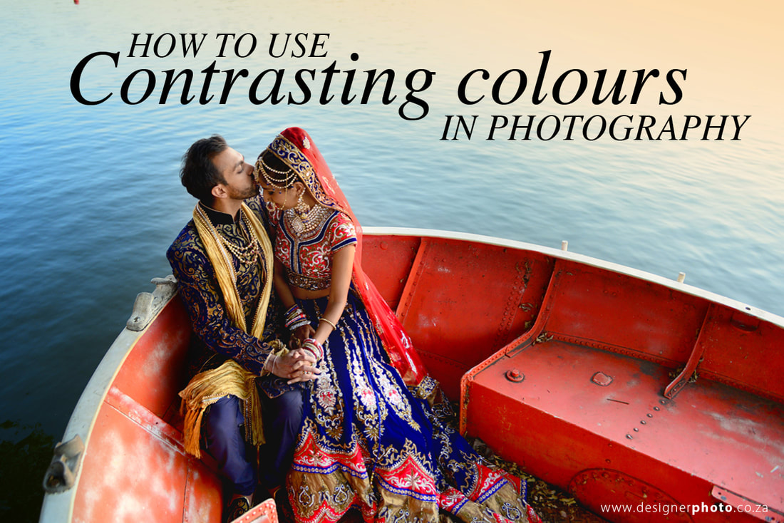
 Colour is an important part of a photo's composition (unless you're shooting black and white of course), although you may not have thought of it that way before. Colour is as much as part of a photo's composition as other building blocks such as shape, form, texture, lines and light. Understanding the difference between contrasting, complimentary and harmonious colours, and using it in your photography can be a game changer when it comes to making images stand out. We would define colour as a style in our photography, we use colour to create and emotional response add drama and make our images stand out. Contrasting Colours are used to add drama and contast. Contrasting colours are any colour combination 3 colours away from each other on the colour wheel. See the diagram below. 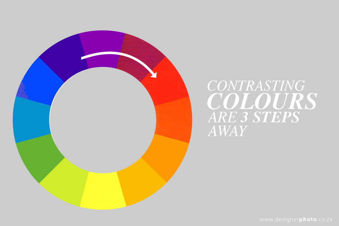 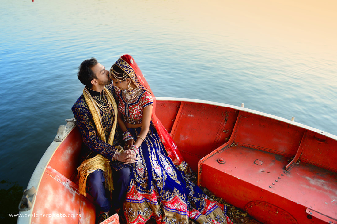 The image above makes use of blue and red. In this example the composition and placing of the couple is key. The colour of the clothing helps the location while the composition ensures that the are only 3 colours are in the frame. Red and Blue being the contrasting colours while the grooms gold scarf adds balance with sunset reflection in the water. Below are more examples of how we used contrasting colours to enhance our photography. 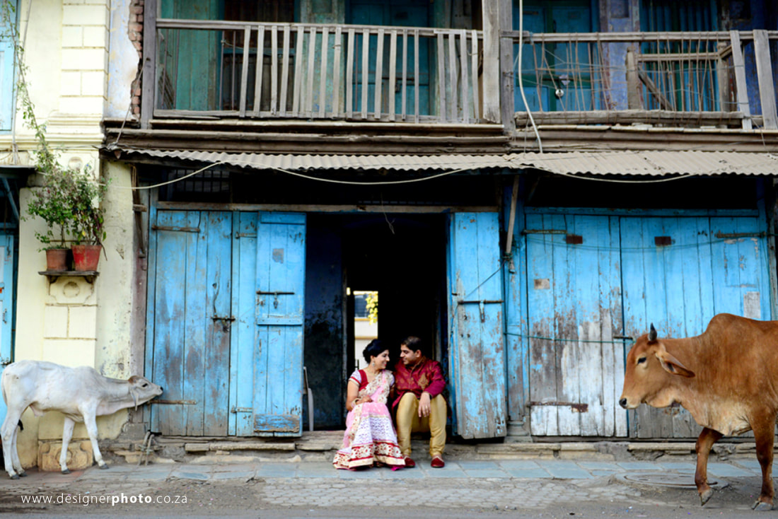 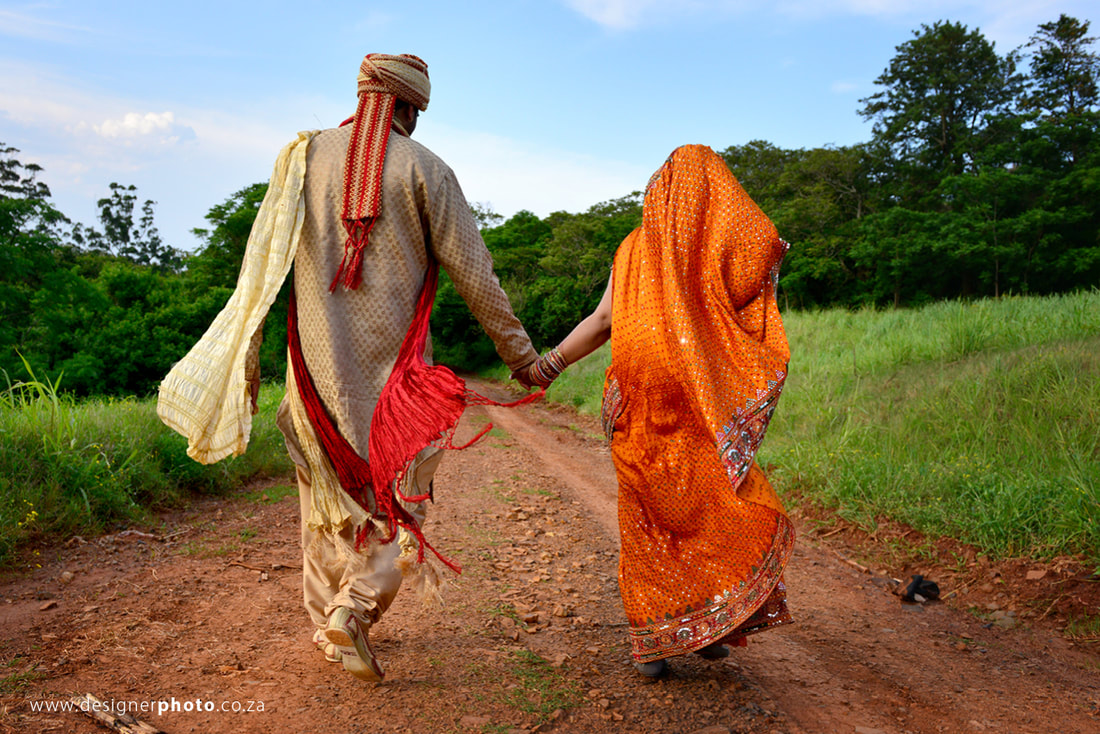 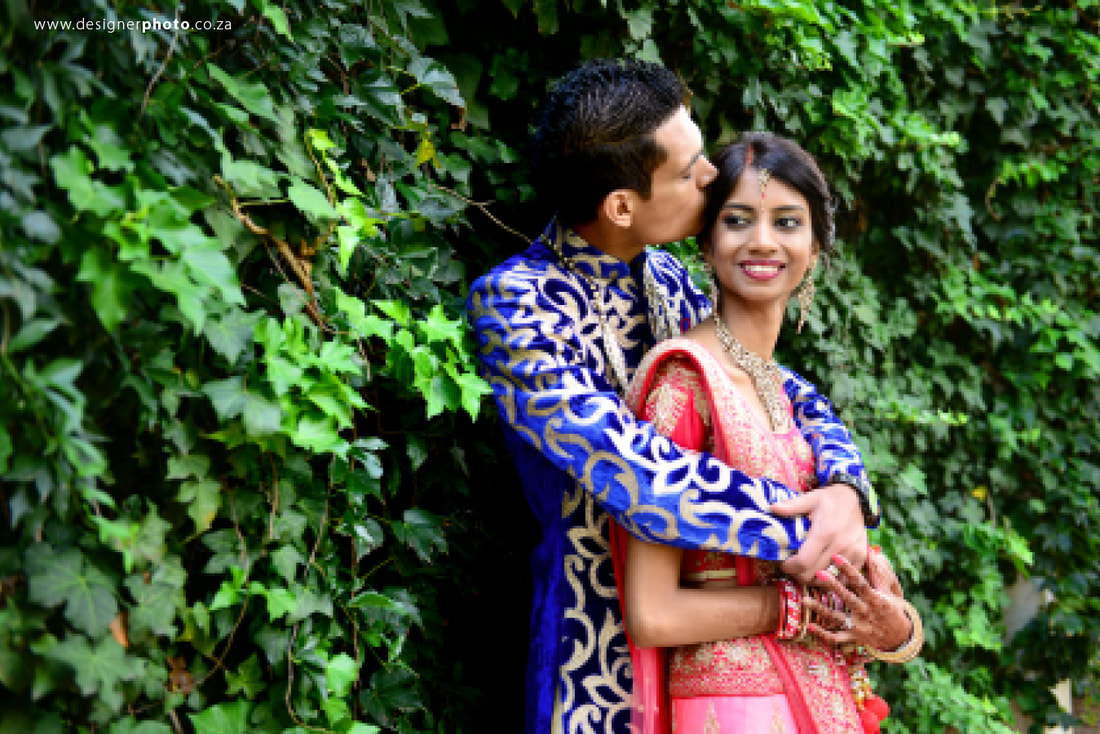
1 Comment
|
WEBSITES AND BLOGS THAT HAVE FEATURED US



copyright of designerphoto.co.za